Final Redesign Project
- thardin4student
- Aug 1
- 3 min read




Planning:
Who is the target market?
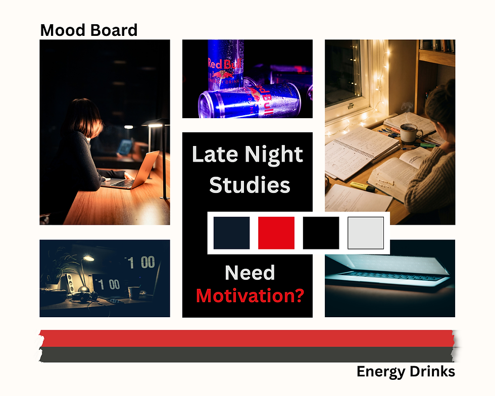
My target market is college students who stay up late studying for quizzes, tests, and big assignments. Most college students have a busy schedule and the only time they can study is at night. Remarketing this Red Bull Ad will help give students something that will help them stay awake and focused. I want this Ad to speak directly to students instead of everyone.
What sort of colors appeal to this audience?
I want darker colors to go into this project to help represent nighttime. I will also use black, dark blue, red, and white. This will help bring Red Bull and studying into the same room. The darker colors will make the ad feel calm and focused, while the red contrast by making it stand out and matches the Red Bull brand. With my white I use it to make the words stand out and easy to read.
What is the emotion you would like to use to sell this product or service?
The main goal of this redesign is to give students motivation. I want students to feel like they can keep going even when they are tired and have a lot of homework to finish. The ad is meant to make them feel confident and ready to do their best. With Red Bull, it can lead you to success if you put your mind to it. Lastly, I want them to feel like they can focus and retain information that will stick with them the next day.
How can you use color, line, and layout to express this emotion?
I can use bold colors and a simple layout to make the important parts stand out. The headline is large so people notice it first, and the pictures help lead your eyes to the Red Bull can. The dark background gives the feeling of a late-night study session while the bright colors add energy. Since the background will be darker, it will make a strong contrast between red and white.
Design:
Specifically, why did you use the colors you chose?
I picked these colors because they fit both the Red Bull brand and the theme of studying late at night. The dark colors represent nighttime, and the red helps grab attention. The white text stands out against the background, making the ad easy to read. These colors work together to create an energetic but focused feeling. The black will help with the focus point of the ad, which will be white.
What is the focal point of the design?
The focal point of my design is the Red Bull can. I placed it where it is easily noticed near the center. The large headline also helps draw attention to the product. The study supplies around it support the main idea of the ad. This makes it clear who the advertisement is for.
Specifically, how did you integrate design elements?
I used balance, alignment, and contrast throughout my design. The headline is large, so it’s the first thing you see. Also, using less than three fonts will help keep the same theme. I repeated the same colors to make everything look connected. Also, the pictures and text are organized so that the ad is easy to follow. These design elements help create a clean and professional look.
Why did you choose the pictures you used?
I chose a picture of a student studying with a book and a laptop. This image matches the college student audience that I am targeting. They help show the idea of staying up late to study. The pictures also connect the product to school and learning. I also used the original photo for the Red Bull logo. Together, they make the advertisement more relatable and effective.


Comments