Color usage in packaging, logos, or advertisements
- thardin4student
- Jul 7
- 1 min read
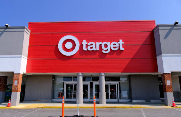
Target is well known for its striking red-and-white logo. Red can symbolize excitement, energy, confidence, and can grab shoppers' attention. While White can represent cleanliness and simplicity. This creates a lot of high contrast. Together, these colors make the brand easy to recognize and create a welcoming shopping experience.

Taco Bell uses purple and white as its main colors. Purple is great because it can represent creativity, leadership, royalty, and quality. The bold purple branding helps Taco Bell stand out from the other fast-food places. This gives the brand a fun, unique personality. They also use White to help make a really strong contrast against the purple. This help people identify the logo faster making a cleaner look.

Ulta Beauty uses two colors, orange and white, for its packaging. The Orange symbolizes warmth, enthusiasm, and creativity. This makes the brand feel fun and inviting. While the White is a clean contrast of purity and simplicity. They both work together and create a bright, modern look that stands out while making the product feel fresh and easy to recognize.



Comments